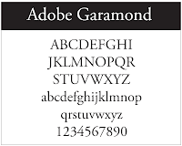
I've been asked in the past by people who do not work in design to suggest fonts for a logo. The style of a font in a logo is very important. Good brand identity will sell a product and can give legitimacy to a website, but most of all, the logo must be fit for the type of work you do. Choosing a font for a logo cannot be automatic, and designers will give great consideration this matter.
But having said this there are some basic considerations a non graphic designer who may be creating a blog or starting a business can give to help them achieve a good looking logo.
Here are some basic rules I use when designing a logo.
1. A logo should standout on but not distract. (sometimes a plain design can standout better than an ornate design it depends on the surrounding in which it is to be placed)
2. It should live in harmony with the rest of page or design.
3. It should fullfil a viewers expectations, it should look right for the field of trade you are in.
remember a font you might choose for a Hair Stylist - may not be right for a Plumber.
4. Simple and ornate can work, but start with simple (always remember it must harmonise)
5. Logos can be a Graphic or Name or Symbol
6. Start a logo design in black and white then consider the colour.
7. Look at other logos or brand designs that are in same field as you.


No comments:
Post a Comment